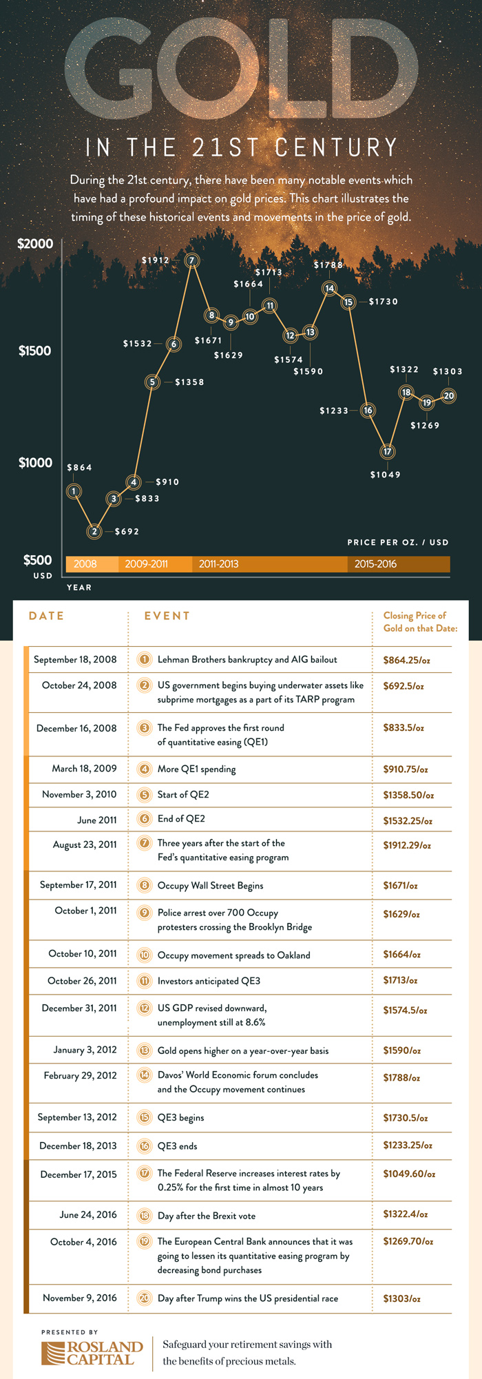
This chart from Rosland Capital shows the price of gold since the Financial Collapse of 2008. It was adapted with different data points from a Gold vs Dollar chart about a quarter way down Rosland’s gold IRA page. Gold increased 5.32% from mid September 2008 to March 2009. By the second round of quantitative easing in November 2010, gold reached $1358 an ounce; 49.2% higher.
If you look at the right-hand side of the chart, you’ll see a familiar range for last year as well. 2016 corresponds to points #18, 19 and 20 on the chart, showing gold in the $1300s the day after the Brexit vote in June as well as its sink back into the 1200s in October 2016.
